
What does "mobile-first" design mean, and why do I want it?
If you're in the process of designing or redesigning your company's website, you've almost certainly come across the current buzz-word in the web-design world: "mobile-first". You may have been advised that you want it, or that it will cost more, or that it's only for hip websites patronized by millenials. But what does mobile-first mean, and why do you want it?
Mobile-first in its simplest sense means that a website has been designed from the start to appear and function perfectly on mobile devices with smaller screens and limited, or different, input and interaction methods. Most of these devices have touch screens instead of mice, and they lack the screen real estate of the average desktop. They also (usually) don't have the bandwidth available to quickly download the large amounts of data that make up videos and large, flashy graphics. The clear trend in device usage and ownership shows us that the pace at which people (your customers) are ditching desktops for mobile devices is rapid, and you want them to be able to use your site.

Mobile-first websites look great and function well on all devices.
So yes, you want a mobile-first design for your site that includes the obvious elements like intuitive and mobile-usable navigation, simple, uncluttered pages that display your brand in a flattering way on the smallest of screens, and lightweight, fast-loading pages that are free of data-hogging graphic bloat. Most good web shops are following these simple guidelines both in the advice they offer their clients and in the websites they produce for them.
There's more to it, though. If your site has any functionality (your consumers are actually trying to buy/schedule/communicate/interact) and is not simply a collection of pages to read, there are important technology considerations that need to be understood at the earliest stages of the design phase, and this technical knowledge is what separates good designers from great designers.
Let's say you're redesigning the website for your vacation rental business. You've got a great new brand package: it's clean, lightweight, and looks great on an iPhone. You got rid of the giant header image that took three minutes to load on 3G, and you've trimmed all of the not-really-valuable pages in order to reduce the complexity of the navigation. Your site is mobile-first, right? Probably not.
Why do consumers come to your site? Probably to do something: book accomodations, check reservation status, check prices. And they might want to do that when they're taking a breather from mountain biking in a remote area with a very bad data connection; they have a specific task they want to accomplish, and they have a very slow network connection to your site. You can't fix their bandwidth issue, but you can anticipate it and design your site so that it functions as well as it possibly can in the worst scenarios.
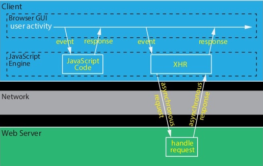
Fig. 1: The right way.
The best practice for a mobile-first website (which, you can see by now, is really any website that wants to have happy consumers) is to create single-page functions for at least the site's core functionality. In this case, that means creating a single page that allows users to enter information like dates, number of guests, location, ammenities, etc. (the query), and then receive the results of that query -- available rooms, cabins, etc. without reloading the header, footer, css, javascript, and anything else that may be linked to within your site's pages. The only data that travels over the network is the data that matters: the query and the response. The response is written over the query section in the mobile browser (Fig. 1), and the user has accomplished the desired task quickly and easily: he has the information he needs, and his perception is that he never left your website. The booking/purchase function is handled the same way, and the consumer is happy.
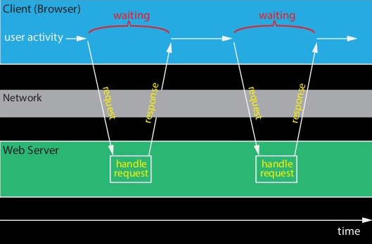
Fig. 2: The wrong way.
Contrast that with the most common way such functions are designed (Fig. 2): the query form is submitted, and the user's browser goes blank as it waits for the entire result page to load (sometimes the query function is even broken up over multiple pages to make it "easier" for the user to enter information). Each linked resource -- images, CSS, javascript, etc. -- is at least checked to see if there is a newer version (if not downloaded again), eating up precious bandwidth and processor time. The user is impatient, not knowing how long it will be until your website comes back, or if it will. What should be most important to you, as the business owner, is that during this time your coveted consumer is probably thinking negatively about your brand. After all, he's trying to accomplish the most fundamental task -- the only reason your site even exists, to him -- and it's not easy. Even if he's able to complete his task, that feeling will remain with him.
The virtues of designing for mobile devices first are not diminished when your consumer is on a laptop or desktop. Light, clean design and clear, responsive task flows make users happy on any device. As a business owner, you want your website to embody these design qualities because you want your consumers to be happy with your brand.
A thoughtfully-designed mobile-first website is one that essentially behaves like a native app* and is tenaciously focused on discovering, then providing what its consumers want. Until recently, it wasn't possible to create one website that functions and appears essentially the same on any platform; now, it's not only possible -- it's expected and essential. At cascade web//development, we have the experience and technical expertise to guide you through the process of designing and building the most effective web presence possible, from strategy to completion.
*Stay tuned for our upcoming blog post on this subject, and on the web browser's evolution into a mini operating system. Exciting stuff!