There’s probably a similar anecdote for every skilled trade to the one I’m about to tell. During and after high school, I worked at bike shops. I even became a certified bicycle mechanic. I worked at several shops over a twenty-year period. I repaired and assembled bikes from 9 am to 6 pm and these were rarely the cleanest, most quality, or functioning bicycles out there. It wasn’t always the easiest job! Here’s where this begins to apply to the topic of this article... The last thing I wanted to do when I clocked out at the end of a long day was to tune my own bike. I just wanted to ride it. This paradigm affects many other industries, trades, and professions.
In my case now, I help our clients design, create, and deploy websites or other online tools. Our developers work hard to overcome challenges for our clients on a daily basis, simply to make our client’s lives “easier.” So when it came to refreshing our own brand, we had to make a very deliberate effort. To top it off, we decided to give our website a fresh coat of paint as well. We felt this was an excellent opportunity to “practice what we preach.” I also saw this as an excellent opportunity to talk about how I approached this project. In order to do so, I’ll have to rewind a little and start at the beginning…
Cascade got its start back in 2001 and over the last couple of decades, there have been a number of creative “cooks in the kitchen.” Each, with a unique perspective and influence on the Cascade brand. This creates a certain amount of heritage if you will, to the logo and how it has evolved through time. I’ve learned so much about what our company has been through and how the brand has been built to what we know it as today. As a Designer, I’ve always made it a point to respect that historical process. And as a Brand Manager, it’s also my job to protect and maintain the consistency of the brand. I’d never go to the Grand Canyon and suggest that its course be changed. It took a lot of water and time for the Colorado River to push through obstacles and create the curves and cliffs we enjoy today. The evolution of a logo can sometimes take a similar path.
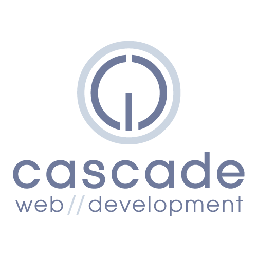
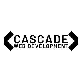
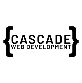
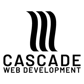
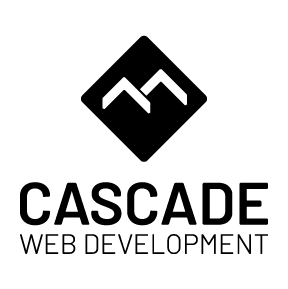
Take a look back at these older versions of the Cascade logo I dusted off;
2001

2004
2010
2014

2015
2019

My main objective starting out was to; respect where the logo and the Cascade brand have been, honor the work put into creating past brand imagery, offer a fresh perspective to the logo, and finally, to provide a fresh look without drastically changing the functionality or structural integrity of the current site.
This framed how I would approach design options and what rules I needed to follow in order to maintain brand consistency. I approached client work with the same awareness and sensitivity. Below are some of the questions that help shape the guidelines to this process;
Logo:
- The Current Logo
- Why does the logo look the way it does?
- Weight, color, texture, feel, etc
- What is it trying to communicate?
- Happy, professional, technical, fun, sporty, etc
- What are the “must-have” elements?
- Historical, logical, emotional, etc
- Historical, logical, emotional, etc
- Why does the logo look the way it does?
- A New Logo
- How far can I depart from the old?
- Edgy and progressive or slightly conservative
- Why do I suggest this change
- Define and explain the reasoning behind this change
- What new element(s) should I include?
- How far can I depart from the old?
(This approach is typically not agnostic for a website.)
Website:
- Current Website
- What was the goal of this site
- Who was the target audience
- Why was this layout designed
- New Website
- What is the goal of this site
- Who is the target audience
- Why is this layout designed
- Is there anything that should be added
After thoughtful consideration and answers to the framework questions, I began to create some rough concepts. There’s probably a number of approaches a designer can take to get to the final product. But I don’t know of any approach that doesn’t start with rough sketches or wireframes. “The more the merrier,” some would say. It’s true. Depending on the project, I like to create enough bad ideas to reveal the good ones. Creating this logo for example, I created about 10-20 different rough sketches. (I remember in school we would do at least 50 sketches before we turned on a computer.) From there, stakeholders are able to begin to visualize their “likes & dislikes” and offer feedback that will guide the process. Through several rounds of edits, comps and critiques, we were able to settle on one logo. There are always variations of the final logo that need to be confirmed as well. These variations can consist of color, size, shape, and intended use.
Here are a few of the variations that didn’t make the cut;
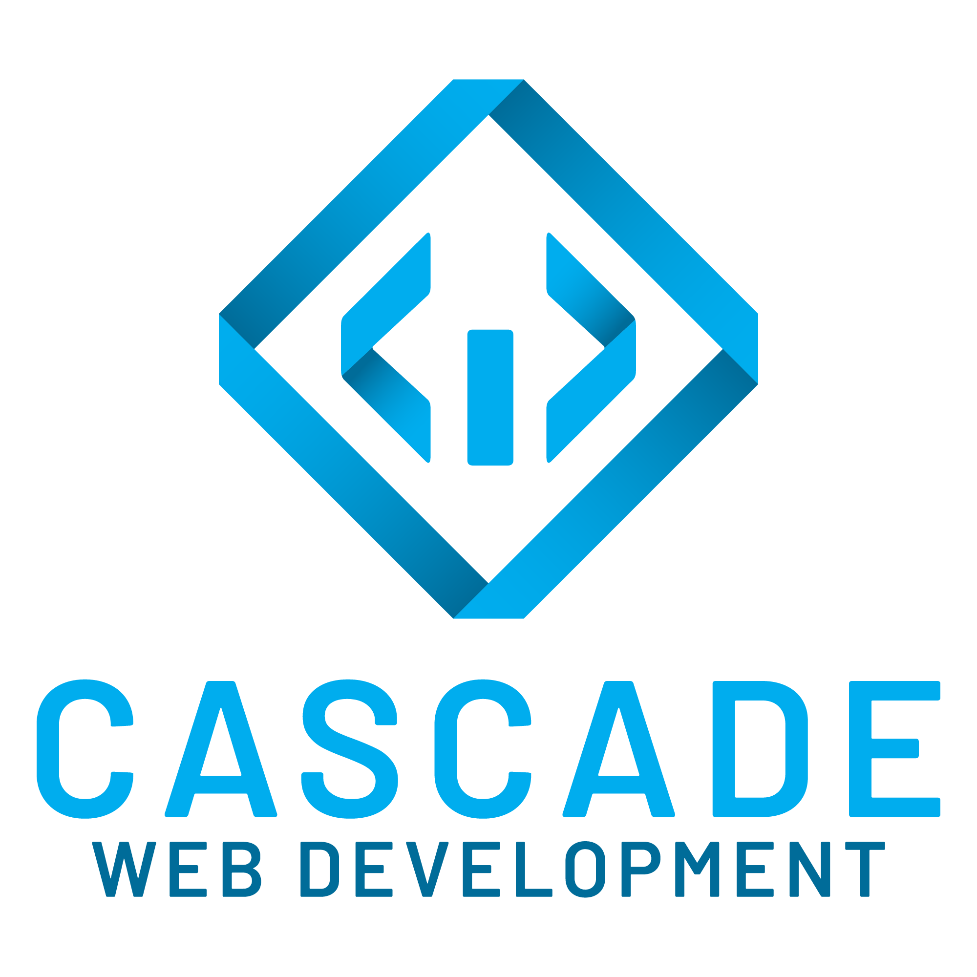
Once I felt we were on the right track for the logo, I began to test different color variations. I wanted it to be something fresh and tied to the company name. I created two shades of blue that I named, “Runoff” blue and “Deep” blue.
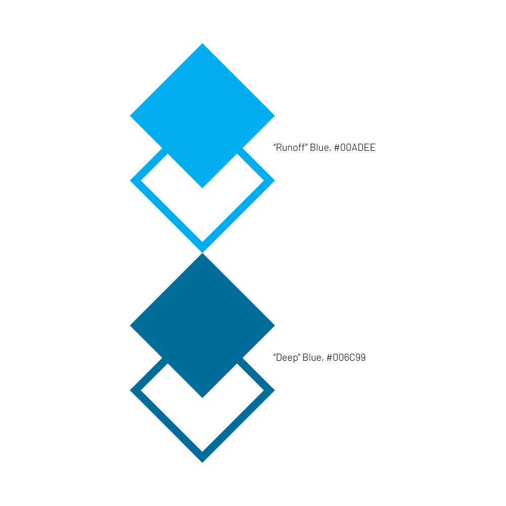
These colors would be layered to show depth and represent shading in the logo. These colors would also help the Cascade site feel cool and refreshed.
Check out the PROTOTYPE for the CWD site!!
As I mentioned at the beginning, there’s always a balance between creating something completely new and refreshing what already exists. Because we are constantly creating or maintaining client sites, we had to set aside time to make the investment into our own brand. In our case, it’s a sampling of who we are and what we are capable of. In many cases for our clients though, it’s the need to better communicate with or relate to their target audience. There is rarely a “set in stone” approach to maintaining brand image. The idea of brand is organic, alive, and constantly evolving into something new.
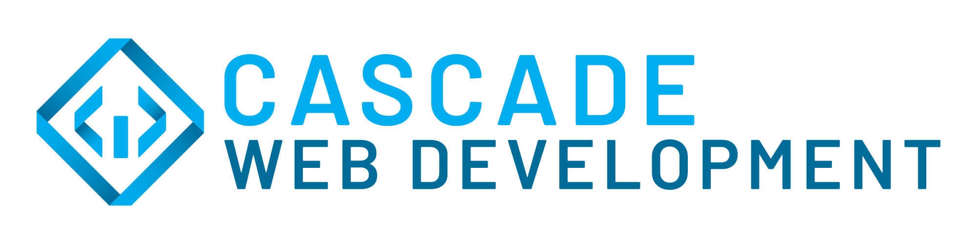
Our final logo wasn’t really a departure from the prior iteration but more of an evolutionary step. Adding overlapping gradients gave the diamond icon a more modern look and the new blue colors make it feel refreshing.
I always get excited at the beginning of a project like this. Once the rules are defined, imagination is the only limiting factor.