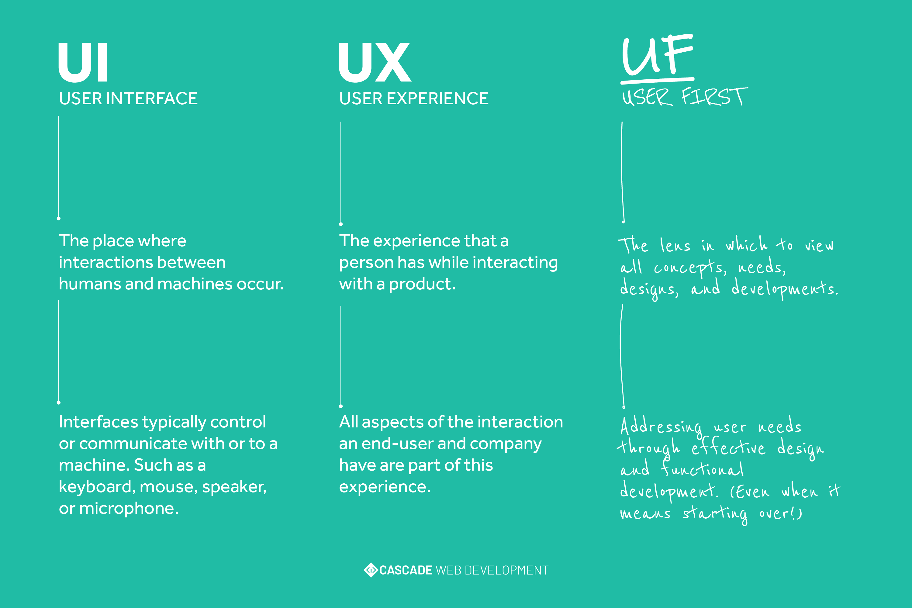
The UI & UX (User Interface & User Experience) of a website is the subconscious navigator of success or failure.
Why not add a UF (User First) approach by considering all this from the very beginning?
Starting an online project with a well-thought-out User Experience built into a quality User Interface will allow you to keep a viewer’s attention longer and increase sales numbers simply because it’s easier to get from A to B. However, there is still a potential of failure if you don't start with the User First and potentially causing the opposite effect by driving your customers/readers away because of technical or cognitive frustration. The quality or efforts made towards a websites' UI/UX can sometimes not be so obvious. For example, your user should always be considered when choosing a color for a logo or theme. After all, some of the most simple things can cause an unwanted outcome and an even worse outcome if they are all added together.
There are many ways the appearance of a website can evoke an emotion or mindset. Psychologist have categorized these behaviors into 9 Principles. Don’t worry, I won’t regurgitate all this information, show all the Nielsen Norman Group’s research studies, or even quote Aristotle. You should give it a read though, and tell me you can’t relate to having experienced at least one of these principles?!
What emotion do you feel when you see these colors?

- Happy
- Bored
- Angry
- Sleepy
What about these colors?

- Calm
- Silly
- Young
- Peaceful
Now, what about these colors?

- Warm
- Comfortable
- Hungry
- Emotional
If you were to ask enough people, we would begin to see a pattern that is associated with the colors above. For example, the last grouping of colors are actually most commonly associated with fast-food restaurants. Studies show that the color red increases blood pressure and heart rate, which increases hunger. Orange increases mental activity and gives a feeling of comfort. Lastly, yellow makes you happy and energetic. So there's some food-for-thought as you think about what brand colors you should use or the overall theme of your website.
Obviously, the Principles don't suggest colors are the only influencer over your audience. It's fair to say that most sites have some sort of opportunity and potential for improvement. In addition to color, font, font size, imagery, spacing, and functional interactivity.
There are many reasons to choose a layout specific to your industry or business needs. If you're building an e-commerce site, for example, you would be sure to have eye-catching calls to action or an easy sale capture process. If you needed to build a website for a law firm, your aim would be to highlight your areas of practice while enforcing your professional, understanding, and experienced approach. The needs or focuses for these two examples are different in many ways but User First's priority remains the same. Choosing or designing a layout structure is paramount for your overall message and intent for your website but understanding your user (target audience) helps expedite this process.
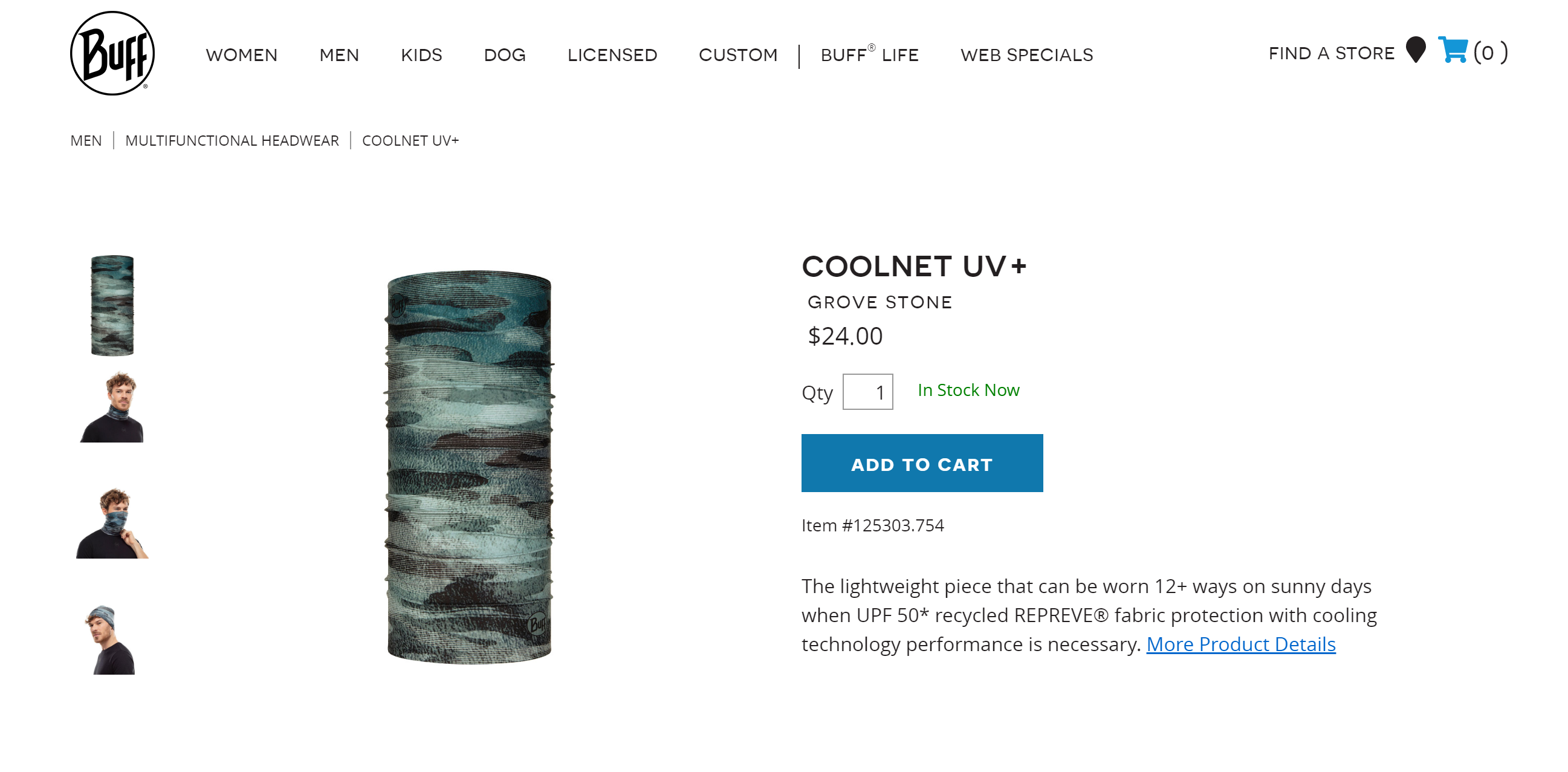
We recently teamed up with the team over at BUFFUSA to revisit the user flow on their product pages. To be transparent, the Buff site is built on our Evergreen platform, which gives us and our client's homecourt advantage as we can modify or customize anything without the use of a new plugin or additional developers. The Buff site is a prime example of an e-commerce website that uses a user-first approach and has found success in leading customers to checkout. The site uses clear, easy-to-read fonts called Novecento Sans and Open Sans. These fonts feel modern and well spaced with clear contrast. The product pages offer a simple filtering functionality on the left to narrow down the user's search but group the offerings nicely ensuring the options available are not overwhelming.
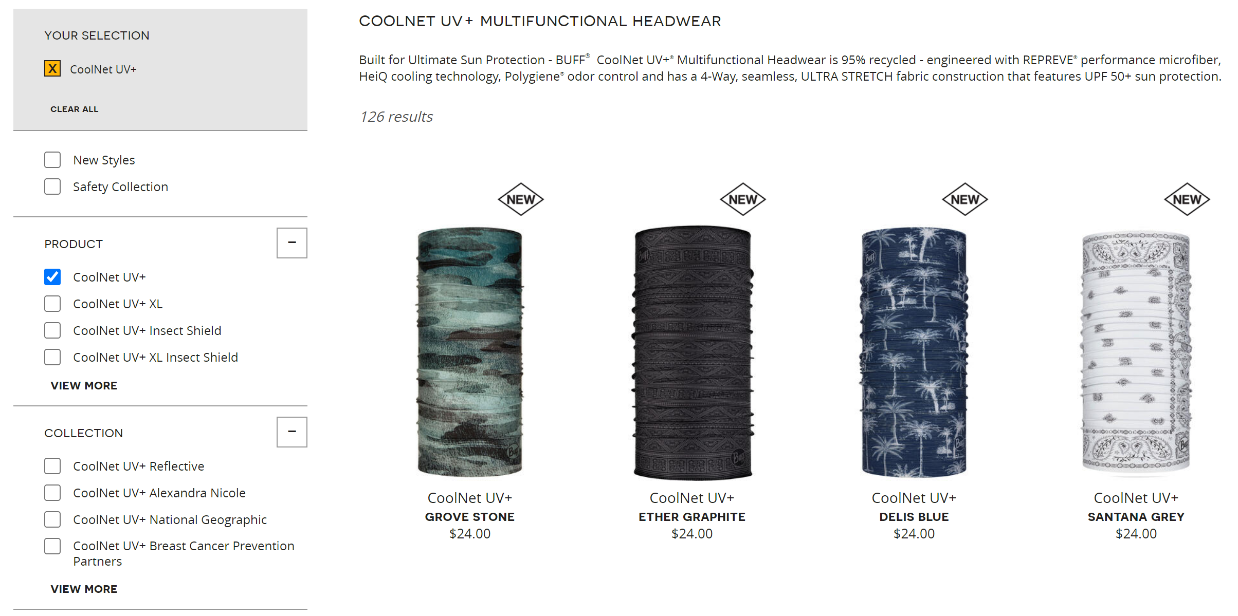
The individual product pages are also clean with some healthy white space and offer a clean hierarchy within the titles, subtitles, and product information. The user can quickly find the information they need to make an informed choice to buy, thus reducing any additional barriers to checkout.
**WARNING - SHAMELESS PLUG!**
Cascade has the experience, perspective, and capabilities needed to thoughtfully build or audit your site! Give us a call or shoot us an email to begin the conversation about looking at your website through the User First lens.