Media Dental Arts — Logo & Brand Refresh
When Dr. Alice Bassani purchased Media Dental Arts in 2024, top priorities were a logo that felt unmistakably hers and brand standards she could roll out across lab coats, letterhead, and a future website. Our process unfolded in four focused steps:
-
Discovery & Research
Kickoff survey + call—We captured Alice’s vision, competitor landscape, and “must-avoids” (no cliché tooth clip-art). Notes surfaced core traits: precision, friendliness, and a digital-first mindset. -
Concept Development
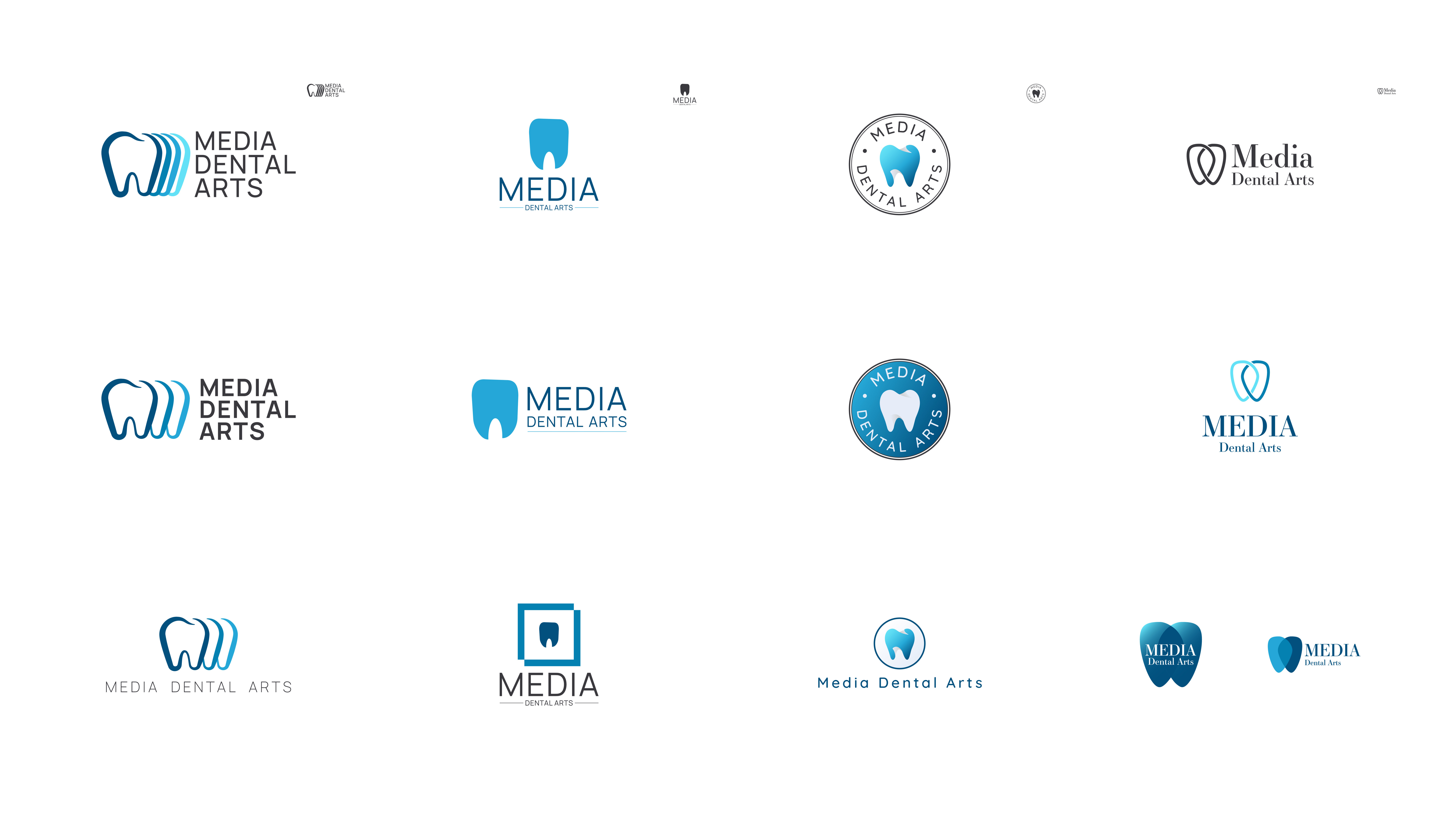
Armed with those insights, we produced three distinct directions:-
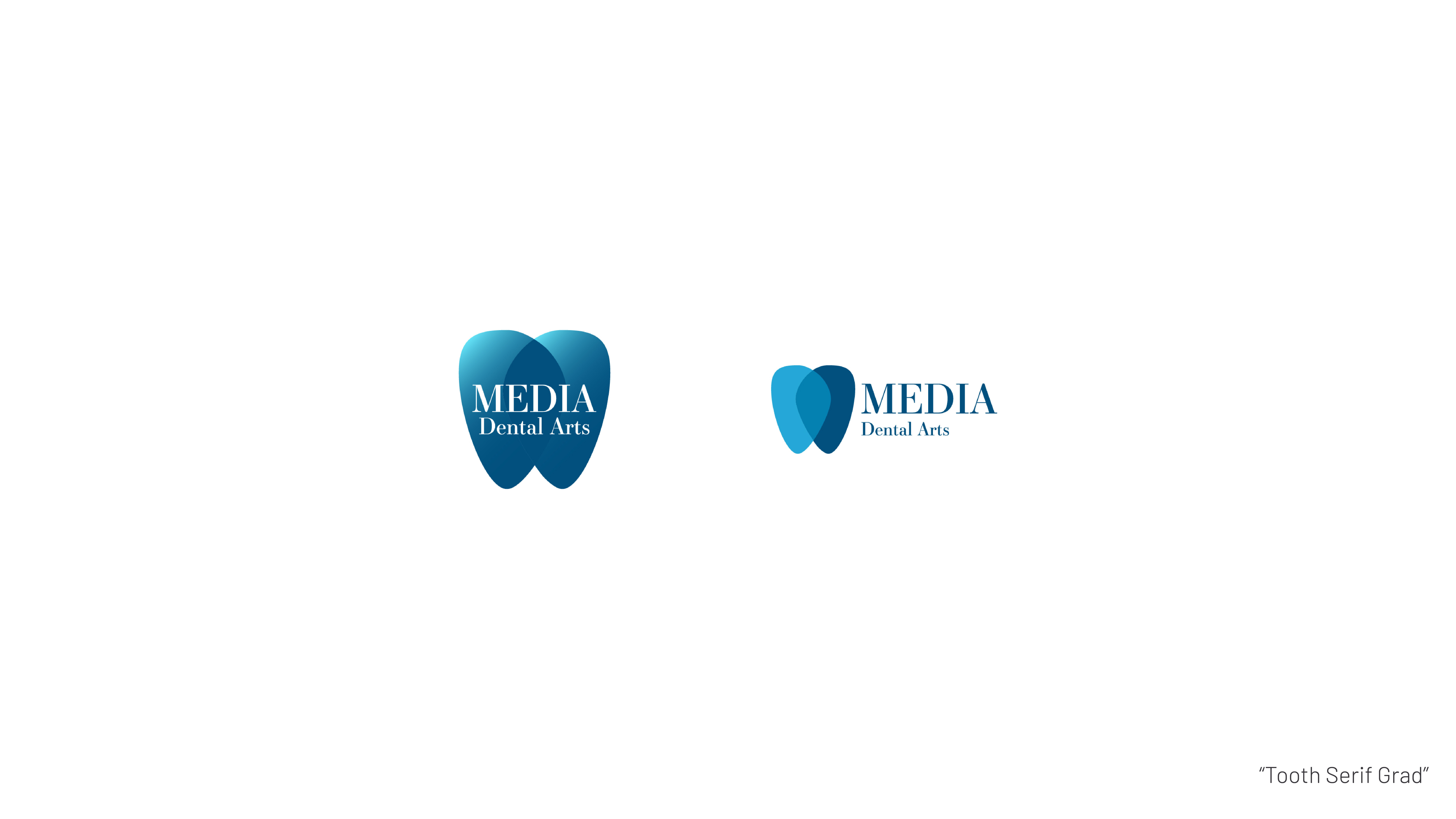
Digital Tooth Outline—clean lines with subtle smile arc
-
MDA Monogram—interlocking initials inspired by CAD-CAM milling paths
-
Geometric Crown Mark—angular facets hinting at zirconia restorations
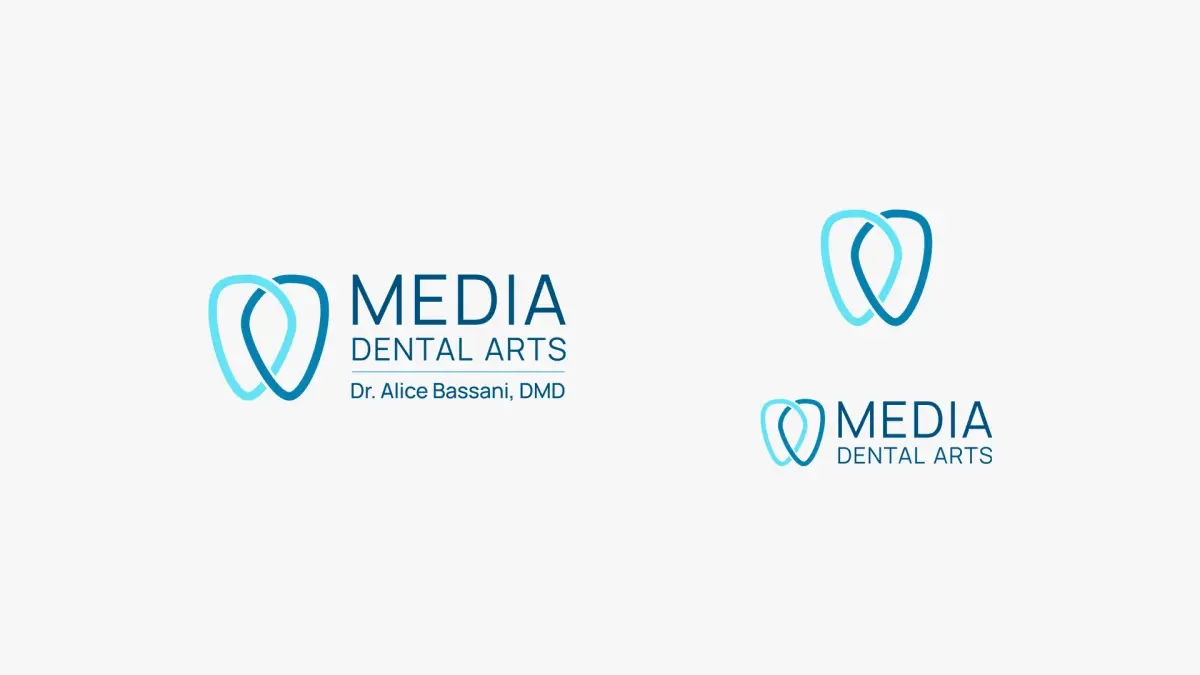
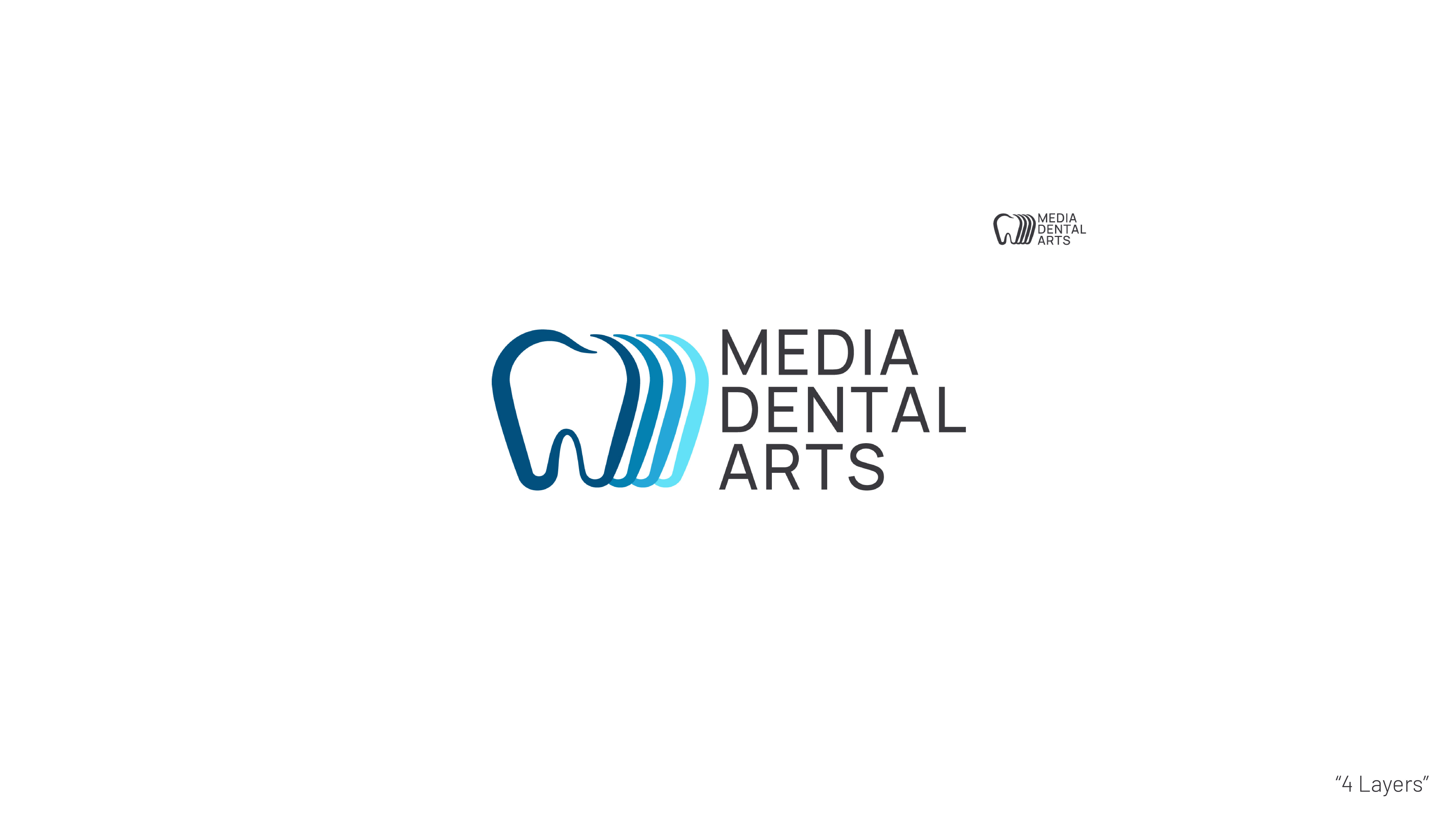
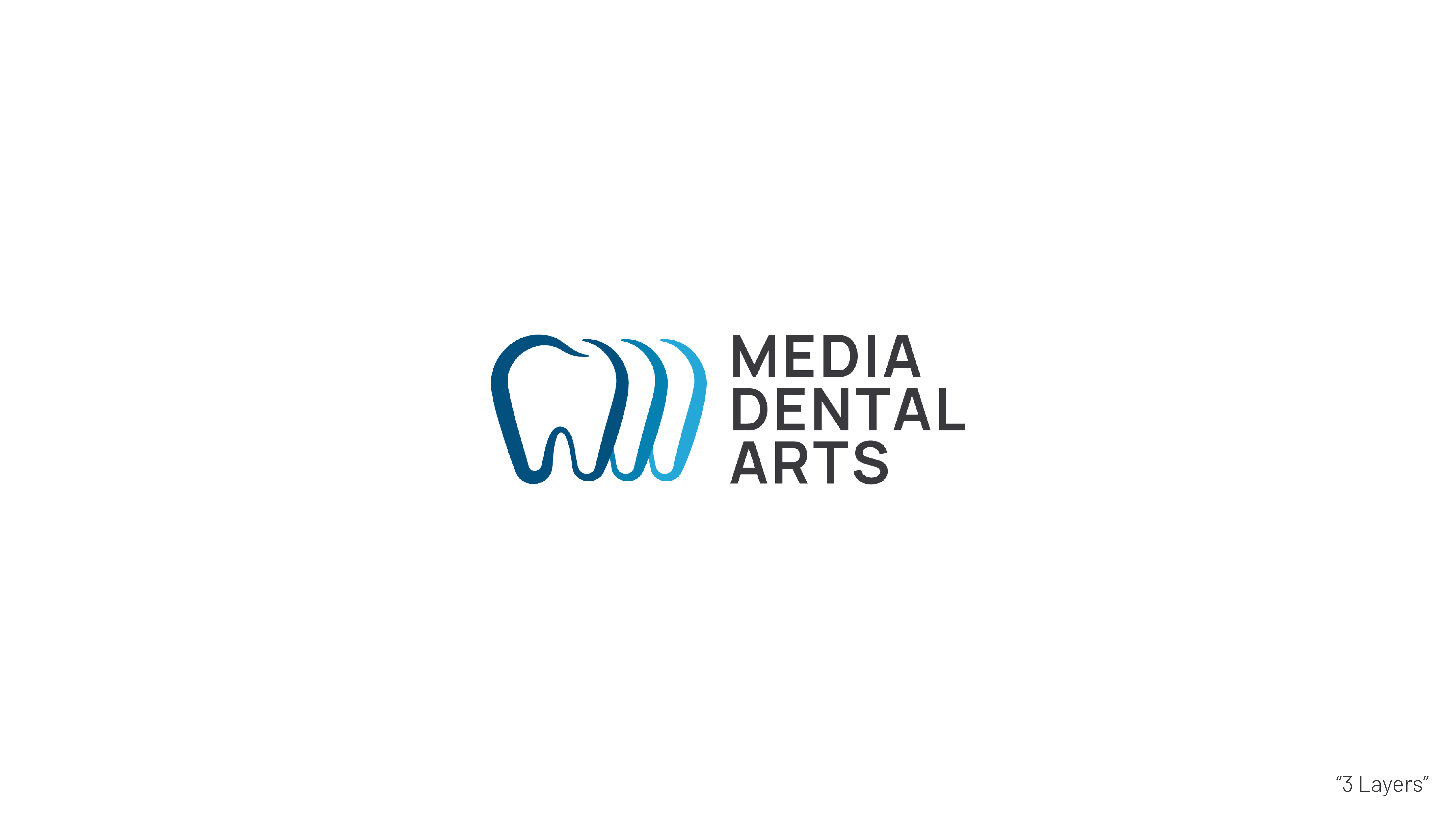
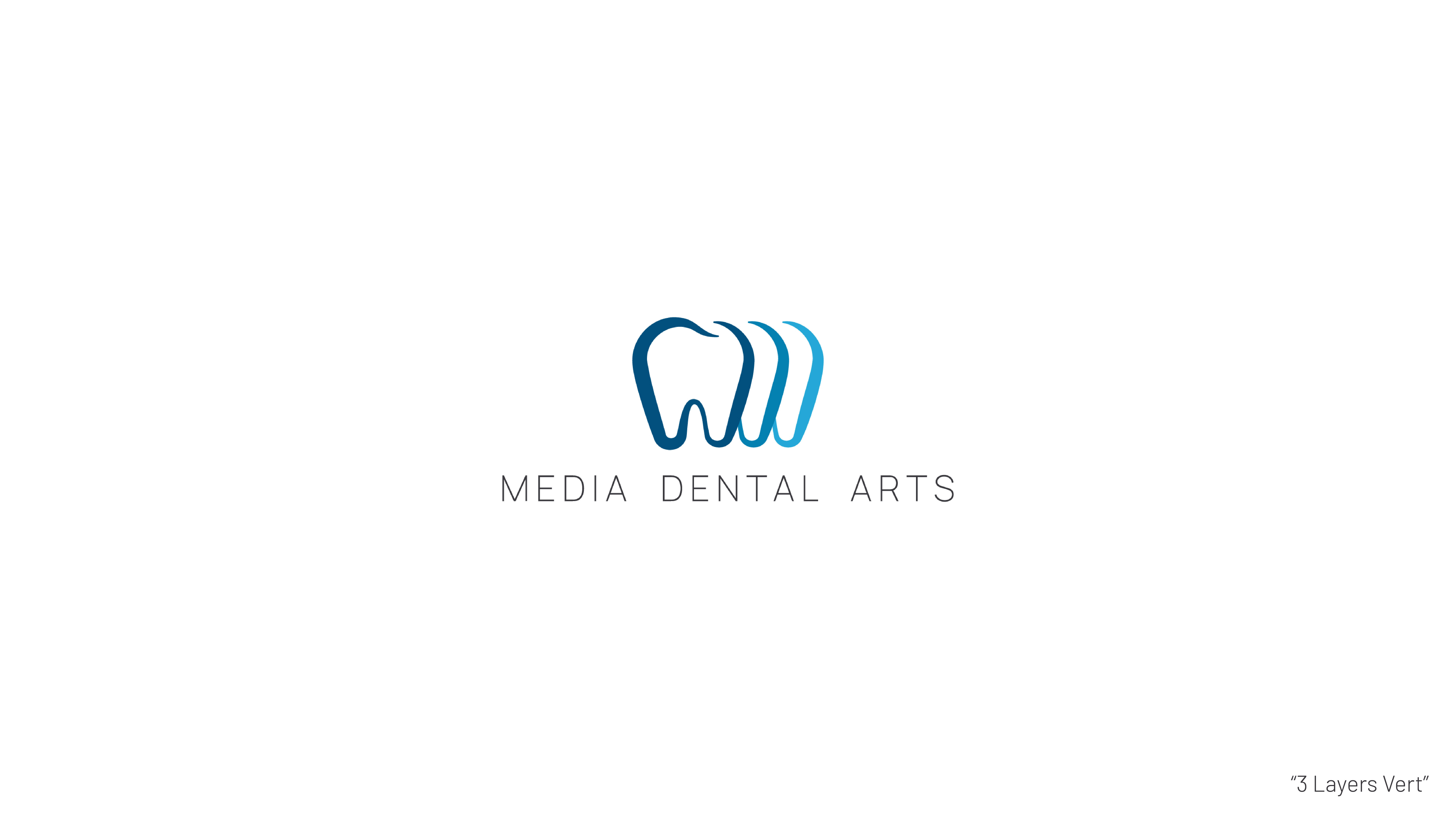
Alice gravitated to the tooth outline for its balance of warmth and professionalism.
-
-
Refinement & Revision
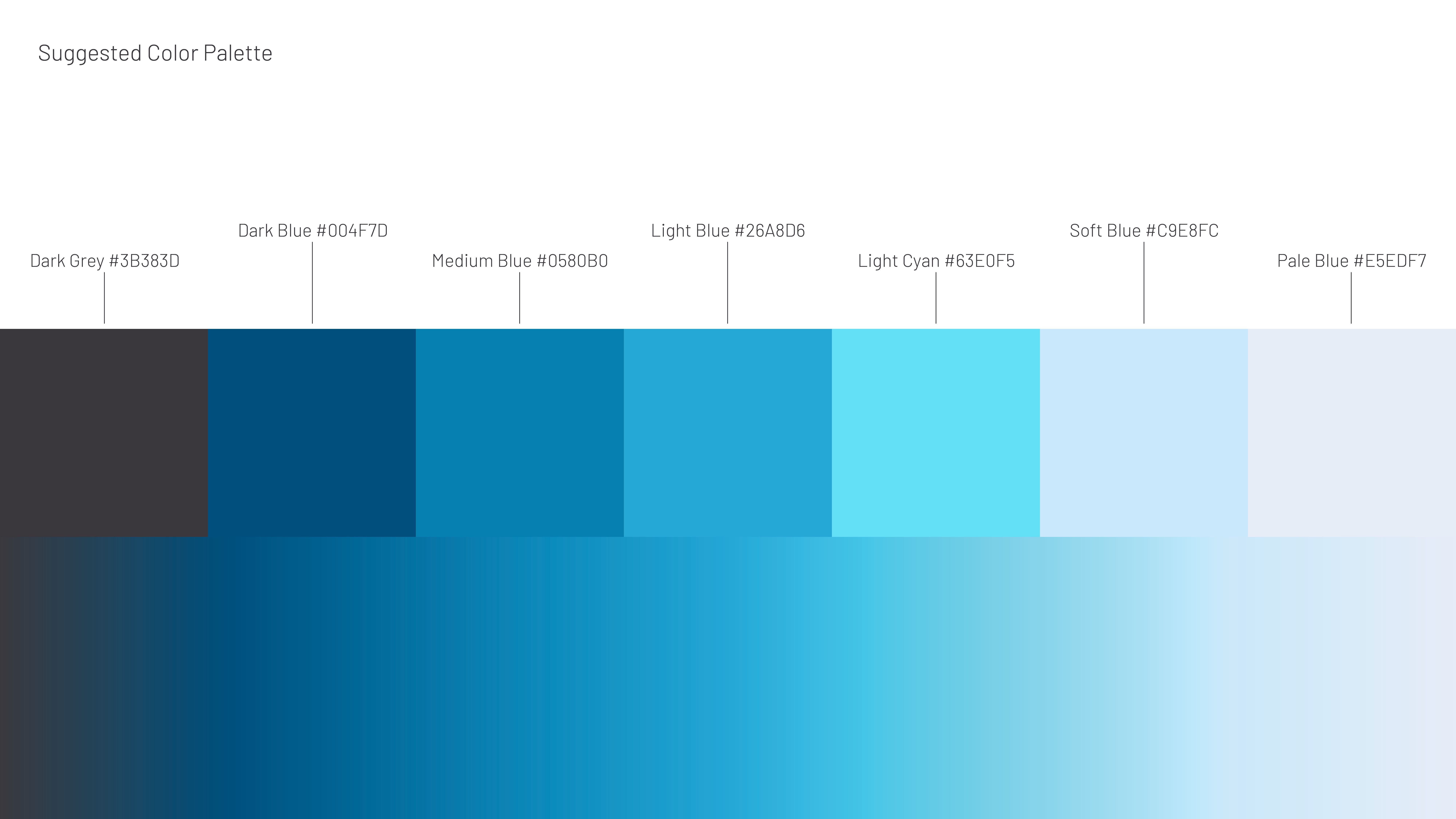
One revision round tightened curves for small-scale legibility, selected a modern humanist sans-serif, and fine-tuned negative space. We locked a two-tone palette—Sterling White and Cobalt Mint—tested for print and web contrast. -
Final Delivery
We shipped the mark in PNG, SVG, EPS, and print-ready PDF formats alongside a mini style guide covering logo clear space, misuse examples, typography hierarchy, and color specs for CMYK, RGB, HEX, and Pantone.
Outcome
Within weeks the new identity appeared on exterior signage, lab packaging, and email signatures—signaling fresh ownership without confusing long-time dentist partners. The style guide now drives every creative activation, and its clarity shortened the timeline for the upcoming website redesign.
