Color on the Web: Why It Matters — And How to Use It
Color in web design isn’t just decoration — it shapes how people feel, how they perceive your brand, and how they behave. When used thoughtfully, color can:
- create emotional tone and atmosphere
- guide a visitor’s attention and highlight important elements (like buttons or calls to action)
- reinforce brand identity and consistency
- improve readability, hierarchy, and clarity
- influence trust, engagement, and conversion
Yet color also carries risk: used haphazardly, it can clash, confuse users, or undermine credibility. That’s why many experienced designers rely on color theory, contrast, and psychology — rather than guesswork.
Here are some practical guidelines I often share with clients and teams.
Principles for Effective Color Use on Websites
Start with a neutral base
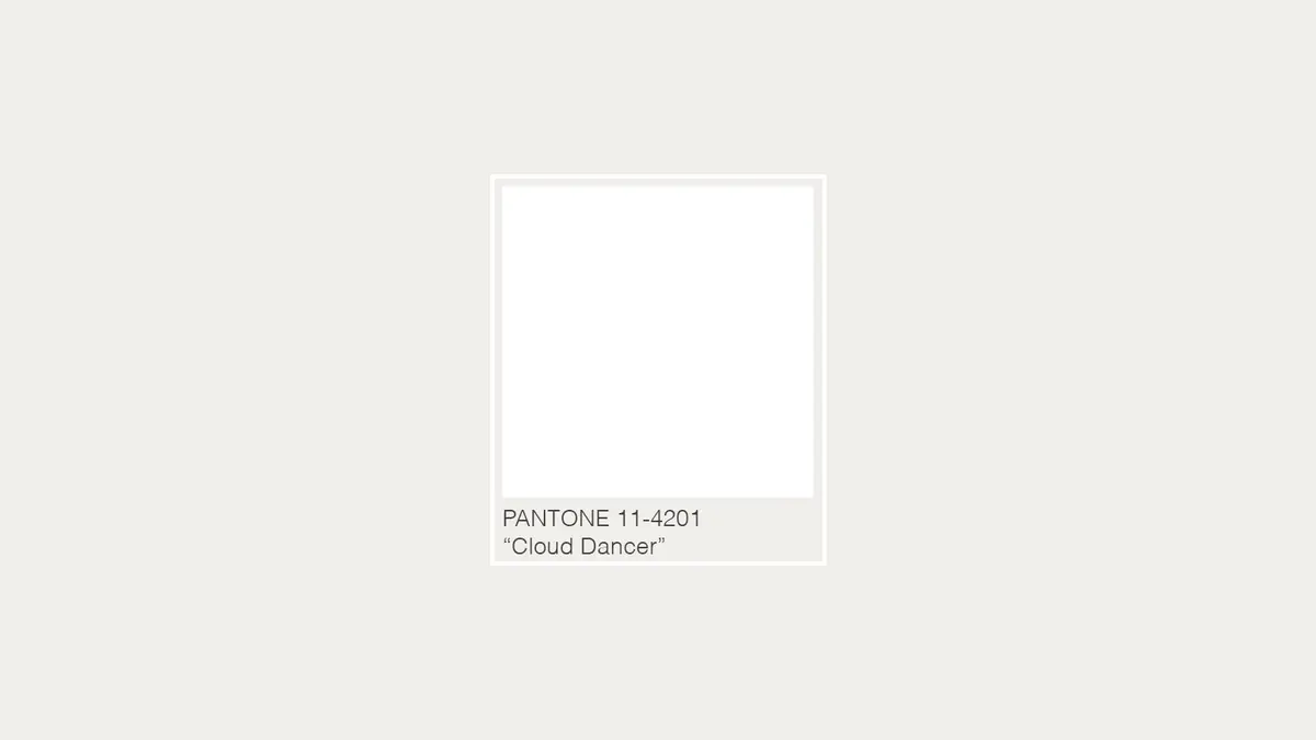
A background of off-white, light gray, or a soft neutral — especially something like Cloud Dancer — gives you a stable canvas. It keeps the site clean, uncluttered, and lets content breathe. You can then layer in richer or more saturated colors for emphasis.
Use a simplified, cohesive color palette
Rather than using 10+ different colors, pick a small palette (often 2–4 colors). Use most for backgrounds and body copy, and reserve brighter or contrasting colors for calls to action, links, or accents. This preserves harmony and avoids overwhelming the user.
Leverage contrast and hierarchy
Contrast — light vs. dark, muted vs. saturated — helps guide the eye. It’s especially important for readability and accessibility. Make sure text contrasts sufficiently against its background. And use color consistently so users recognize what’s clickable or important.
Consider emotional tone and brand voice
Different colors evoke different feelings. Blues tend to feel trustworthy and calm; reds evoke energy and urgency; earthy tones (like browns) feel cozy or grounded; neutrals feel clean, timeless, and open. Choose colors that reflect the values and tone you want your brand to communicate.
Color accessibility matters
Many users have color vision deficiency, and usability suffers when the color contrast is poor. Always test your palette for legibility and usability across devices and user types. A design may look pretty, but still exclude people if accessibility is ignored.
Don’t overlook white space
White space (or “negative space”) isn’t wasted space — it’s a powerful design tool. It gives visual breathing room, makes content easier to digest, and gives emphasis to the right parts of the page. A neutral base color supports good white space usage.
Bringing Cloud Dancer (and Pantone’s Message) Into Your Web Projects
If I were designing a brand or website today — or advising a client — here’s how I might work with the spirit of Cloud Dancer in a practical way:
- Use Cloud Dancer (or a similar off‑white) as the main background color. This establishes a clean, calming foundation — perfect for content-focused sites, portfolios, blogs, or brands seeking understated sophistication.
- Add one or two accent colors that reflect brand personality or emotional tone. For a wellness brand, perhaps a soft sage green; for a tech‑forward startup, a muted slate or steel blue; for a luxury artisanal brand, a warm brown or charcoal.
- Employ contrast and hierarchy to guide user flow. Headings, buttons, navigation — use stronger contrast or distinct accent colors so users know where to look and what to click.
- Use photography or illustration that complements the neutral base. Light or airy images, minimal compositions, subtle textures — nothing too saturated that fights with the soft background.
- Prioritize readability and accessibility. Especially if the site targets a broad audience. Test for contrast, ensure alt‑text for images, and account for users with visual impairments or lower-contrast displays.
Why “Colorless” (or Nearly Colorless) Might Be the Most Strategic Choice Right Now
You might wonder: isn’t choosing white or off-white a bit... safe? Maybe. But that’s precisely why it can be smart. In a world saturated with bold gradients, neon highlights, and aggressive marketing visuals, a calm, neutral backdrop offers contrast. It signals restraint, thoughtfulness — and prioritizes content over flash.
For brands that want to communicate trust, refinement, longevity, clarity, and calm — Cloud Dancer could be more than a Pantone fad. It could be a new brand design philosophy. (At least for the year.)
By combining that philosophy with a solid understanding of color theory, emotional tone, and user behavior — you build websites that not only look good, but feel right.