We’ve all experienced it.
You visit a new website, and almost instantly, it just feels easy to use. You’re not fumbling for the navigation or second-guessing where to click. You trust it. That reaction isn’t just about taste or preference; it’s rooted in psychology.
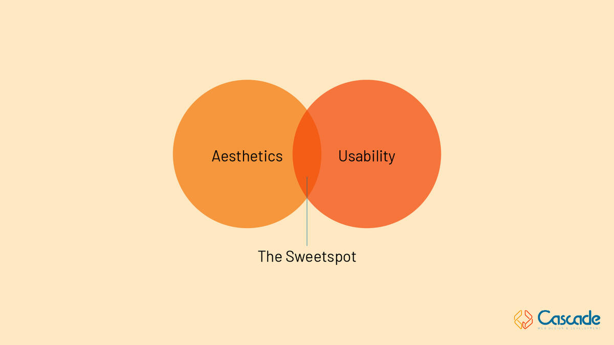
The Aesthetic-Usability Effect describes how people tend to perceive more attractive designs as easier to use, even when they aren’t. First studied by researchers at Hitachi in the 1990s, it’s become a foundational concept in user experience and interface design. In short, when something looks good, we assume it works well.
At Cascade, that idea sits at the heart of what we do every day: balancing form and function, front-end and back-end, aesthetics and usability. Beauty might draw users in, but usability is what keeps them there. And the truth is, the two are rarely separate.
When something looks polished, organized, and intentional, it builds trust. Clean layouts, consistent spacing, and thoughtful use of color create a sense of credibility. The opposite is true, too. Clunky interfaces, jarring color combinations, or awkward typography can instantly make users question whether a site or product is trustworthy. First impressions happen fast. Some studies show users form an opinion about a website in as little as 50 milliseconds. That’s faster than a blink, and it underscores how design isn’t just about visual appeal; it’s about emotional reassurance.
We also know that beauty can forgive small bumps in the road. Users are surprisingly patient with minor usability hiccups if they like what they see. A well-designed interface can make people feel like a product performs better, even if the underlying functionality is the same. That doesn’t mean you can decorate your way out of a bad experience, but it does highlight something important: emotion is part of usability. When design evokes calm, curiosity, or excitement, people are more willing to engage, learn, and persist.